
See The
Colours
Together.
Genre: Photo, Educational
Productivity & Lifestyle
Release Date: July 2020
ABOUT PROJECT
Through Our Eyes is a free application and does not only represent the colorblind community, instead it is relevant for everyone. The mission is to raise awareness in the community, especially in countries that lack knowledge regarding the matter such as Malaysia. With the support and joint collaboration with ColorADD the goal is to make the world more accessible for colorblind and low-vision people through our Augmented Reality (AR) experience and educational insight by ColorADD. To connect colorblind and low- vision individuals with sighted volunteers from our community from all over the world.

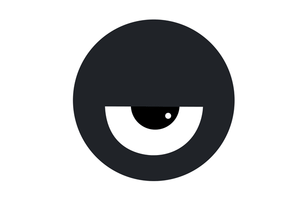
Through Our Eyes logo design is specifically altered for those suffering from color blindness. The main idea is to place an eye as the main center of attention. Reason being, it sends a message that people with color blindness is not discriminated based on their condition. Being said, it represents everyone in general by implementing complementary colors to show more contrast and as a combination make it look pop as an illusion and guide for the users.
BACKGROUND
STYLE GUIDE
Icon App
& Logo


Fonts
Aa
Anton Regular
Color Schemes
Icons
RESEARCH

This idea to construct and execute the project started on 2019, as a way of revolutionizing the color blind community by creating an app to aid those with color blindness. For the longest time, society always lacked the knowledge regarding color blindness.
Utilizing this app it will help them with their daily struggles and daily tasks will be so much more convenient. By doing so, this will present an advantage to upgrade and further work on the app to allow users to have a smooth, convenient and user friendly experience to the application.

CONCEPT
The challenge was to create an app that would help those with color blindness with their struggles and showing those without color blindness the perspective on how it is color blind people view the world. By doing so, we have made it possible for both parties to simultaneously connect and communicate with one another and making it user friendly.
To overcome their issue in their daily life, I developed a design system based on their inconvenience to turn into a relevant and at the same time effective for colorblind users to recognize colors with an easy solution. Taking inspiration from ColorADD, a sign code for aiding color blind people to recognize colors.We made a collaboration that highlights on an educational basis with insights along side a productivity goal.
DID YOU KNOW?
MEN ARE MOSTLY
INHERIT THE CONDITION OF COLOR BLINDNESS BY 8%

01. MALE

02. FEMALE
WHILE FOR
FEMALE POPULATION THEY
EXPERIENCE
COLOR BLINDNESS BY ONLY 0.5%
Why do we see different colors?
Our eyes receive lights in a different way. Different colors correspond to a different wavelength of light
